Now a days mobile friendly website is not only a good practice for website but its also an impotent feature for any website. Mobile user is increasing day by day and they are using internet from their mobile devices. Most of the time peoples are using mobile devices out of the home of while they are taking rest. So nowadays mobile friendly website playing an impotent role in different fields and sectors.
Everyone we know how mobile friendly website playing his rule in our daily life and Search Engine Optimization (SEO). Last few years google giving responsive website priority for his search rank or Search Engine Optimization (SEO).
Now i am going to show some simple steps to make/convert your existing website to mobile friendly and responsive website.
Step 1: Include the viewport meta tag
First of all check existing website meta tag from page source. To view website page source view your website which you want to make/create mobile friendly then right click on your mouse and then view page source. Now check head tag at top of the page and into this head tag you will get viewport meta. if don’t have this meta, insert it into head tag.
<meta name="viewport" content="width=device-width, initial-scale=1">
Step 2: Use media query CSS
Now write media query css into your css file. Using @media rule we include a block of CSS properties into style file and its work only if a certain condition is true. That means it is a conditional css and it will work when your will be true. For an example –
@media only screen and (max-width: 768px) {
/** Add some CSS here **/
}
This code will be work when your browser window size will be smaller then 768px that means it will works for mobile and tab devices. To learn more about Responsive Web Design and Media Queries just visit – https://www.w3schools.com/
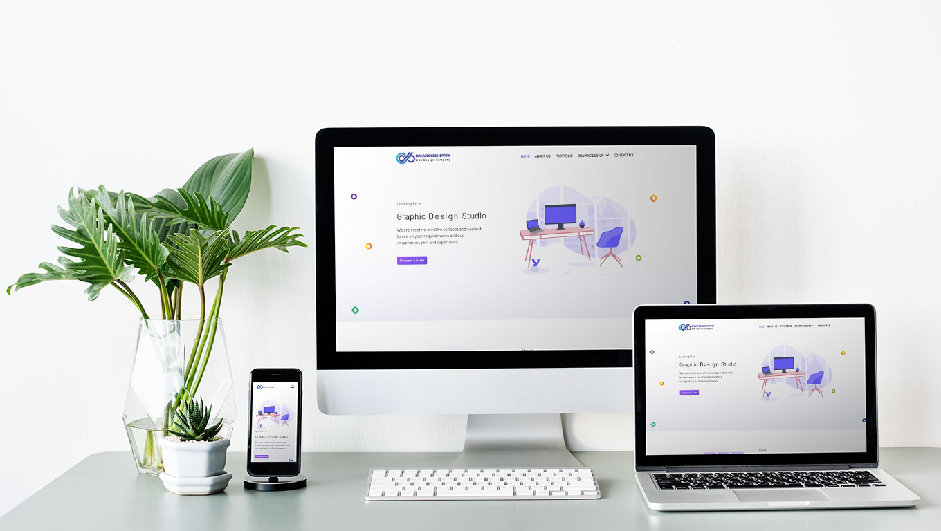
If you think convert/create mobile friendly and responsive website is difficult job for you or you don’t have enougph time to make your website to mobile friendly website then please knock us. We (DreamDesignPark) always ready to help you in this service area.
